Important: unclear posts may not receive useful answers.
Before posting
- Get familiar with Markdown to format and structure your post
- Be sure to update lvgl from the latest version from the
masterbranch.- Be sure you have checked the FAQ and read the relevant part of the documentation.
- If applicable use the Simulator to eliminate hardware related issues.
Delete this section if you read and applied the mentioned points.
Description
What MCU/Processor/Board and compiler are you using?
What LVGL version are you using?
8.3
What do you want to achieve?
I made a chart with micro python.
What have you tried so far?
add code
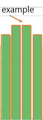
chart.set_style_outline_color( lv.color_hex(0x0002FF), lv.PART.KNOB | lv.STATE.DEFAULT )
chart.set_style_outline_opa(255, lv.PART.KNOB| lv.STATE.DEFAULT )
chart.set_style_outline_width( 1, lv.PART.KNOB | lv.STATE.DEFAULT )
chart.set_style_outline_pad( 0, lv.PART.KNOB | lv.STATE.DEFAULT )
Code to reproduce
Add a code snippet which can run in the simulator. It should contain only the relevant code that compiles without errors when separated from your main code base.
The code block(s) should be formatted like:
##### startup script #####

import lvgl as lv

import display_driver


##### main script #####

def draw_event_cb(e):

    dsc = lv.obj_draw_part_dsc_t.__cast__(e.get_param())
    if dsc.part == lv.PART.TICKS and dsc.id == lv.chart.AXIS.PRIMARY_X:
        time = ["01", "02", "03", "04", "05", "06", "07", "08", "09", "10", "11", "12","13","14","15","16","17","18","19","20","21","22","23","24"]
        dsc.text = bytes(time[dsc.value],"ascii")
#
# Add ticks and labels to the axis and demonstrate scrolling
#
style = lv.style_t()
style.init()
style.set_outline_color(lv.palette_main(lv.PALETTE.BLUE))
style.set_outline_width(2)
style.set_outline_pad(8)


# Create a chart
chart = lv.chart(lv.scr_act())
chart.set_size(350, 150)
chart.center()
chart.set_type(lv.chart.TYPE.BAR)
chart.set_style_pad_column(1, 0)
chart.set_range(lv.chart.AXIS.PRIMARY_Y, 0, 100)
chart.set_point_count(24)
chart.add_event_cb(draw_event_cb, lv.EVENT.DRAW_PART_BEGIN, None)

# Add ticks and label to every axis
chart.set_axis_tick(lv.chart.AXIS.PRIMARY_X, 0, 0, 24, 1, True, 24)


# Zoom in a little in X
#chart.set_zoom_x(300)

# Add two data series
ser1 = lv.chart.add_series(chart, lv.palette_lighten(lv.PALETTE.GREEN,1), lv.chart.AXIS.PRIMARY_Y)
#ser1 = lv.chart.add_series(chart, lv.palette_main(lv.PALETTE.BLUE, lv.chart.AXIS.PRIMARY_Y)
#chart.add_style(style, 0)
chart.set_style_outline_color( lv.color_hex(0x0002FF), lv.PART.KNOB | lv.STATE.DEFAULT )
chart.set_style_outline_opa(255, lv.PART.KNOB| lv.STATE.DEFAULT )
chart.set_style_outline_width( 1, lv.PART.KNOB | lv.STATE.DEFAULT )
chart.set_style_outline_pad( 0, lv.PART.KNOB | lv.STATE.DEFAULT )


# Set the next points on 'ser1'
chart.set_next_value(ser1,00)
chart.set_next_value(ser1,10)
chart.set_next_value(ser1,20)
chart.set_next_value(ser1,30)
chart.set_next_value(ser1,40)
chart.set_next_value(ser1,50)
chart.set_next_value(ser1,60)
chart.set_next_value(ser1,70)
chart.set_next_value(ser1,80)
chart.set_next_value(ser1,90)
chart.set_next_value(ser1,90)
chart.set_next_value(ser1,80)
chart.set_next_value(ser1,70)
chart.set_next_value(ser1,60)
chart.set_next_value(ser1,50)
chart.set_next_value(ser1,40)
chart.set_next_value(ser1,30)
chart.set_next_value(ser1,20)
chart.set_next_value(ser1,10)
chart.set_next_value(ser1,00)
chart.set_next_value(ser1,10)
chart.set_next_value(ser1,20)
chart.set_next_value(ser1,30)
chart.set_next_value(ser1,40)

chart.refresh()  # Required after direct set
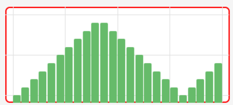
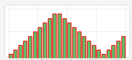
Screenshot and/or video
If possible, add screenshots and/or videos about the current state.
I can not read&write English very well.
I am relying on google translator.
I’m using MicroPython right now, but I’m planning to use C.
I’d appreciate it if you could tell me what needs to be fixed in both MicroPython and C.
Thx