Hi,
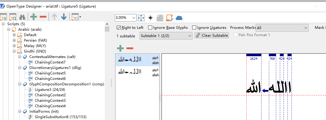
I’m having trouble to display arabic characters with double accent correctly using the built-in arabic font. For example, the phrase ذكرني لاحقًا has a double accent near the end which the double line sits on top of the double dot (may need to zoom in to see). However, the double line seems considered as a new character at the moment and the last character broke off from the word.
The way I generated the phrase above is simply using the widget demo and modify one of the phrases into ذكرني لاحقًا and set the font to lv_font_dejavu_16_persian_hebrew.
Is there a unicode character for this complex glyph?
The 0x600-0x6FF range is part of the built in font and I’ve checked that 0x064B is really part of the font. You can also see it if you open the Persian font search for 064b.
So it’s 2 characters on top each other. LVGL supports it, e.g. in Hindi writing a lot of ascent glyphs have negative x offset, which moves them above the previous glyph.
The information that LVGL sees from ً ( U+064B) looks like this:
adv_w: 0   # do not push the next character
box_w: 6   # 6px wide
ofs_x: 1   # 1px shift on the box
For ق (U+0642):
adv_w: 12   # start the next character after a 12 px space
box_w: 12   # the bounding box of this character is 12 px wide
ofs_x: 0    # 0px shift on the box
When LVGL draws the letters the following happen:
LVGL always draws from left to right
The first letter اis drawn normally
ً comes next on 6 px. As adv_w = 0 the next character will start as if ً wasn’t there at all.
Now ق comes on 12 px, so ً should be above the left half of it.
And it really looks like this:
The issue I see is that the incorrect form of ق is used because it tries to connect to ً but it there is no rule for it.
Is these kind of accents common in Arabic? If so I wonder how was this is issue not spotted so far.
Anyway, if you agree that this is the root of the issue, it can be fixed in lv_txt_ap.c by skipping these special characters.
The double line is part of the 6 Arabic vowels so I’d presume it’s quite common.
From the link below, you will see that the double line is called tanwin fatha (two fatha vowels)
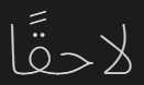
I further tested with other vowels. The image below is a string I copied from the website above without the basic fatha vowel (right) and with the fatha vowel (left).
This is another vowel (kasra) I tested.
The results seem to show that at the moment none of the vowel characters are considered in the joined form
After studying how the conjunction works in lv_txt_ap.c, I made a small modification to check and skip if the current or next character is a vowel.
Code below is written inside _lv_txt_ap_proc straight after calculating index_current and idx_next (may need more fine-tuning in the future)
if (lv_txt_is_arabic_vowel(ch_enc[i])) {  // Current character is a vowel
    ch_fin[j] = ch_enc[i];
    i++;
    j++;
   continue;   // Skip this character
}
else if (lv_txt_is_arabic_vowel(ch_enc[i + 1])) { // Next character is a vowel
   idx_next = lv_ap_get_char_index(ch_enc[i + 2]); // Skip the vowel character to join with the character after it
}
This is the function I made for checking an arabic vowel
Now the displayed string is like this:
Which is much closer to what it’s supposed to look like but the double line is still misplaced at the moment as it should sit directly on top of the double dot. My next question is how and where is the x position retrieved/calculated?
Good news! Can you send Pull request with the changes so far. I understand that it’s not perfect yet, but definitely better than before.
Here are the steps LVGL does:
In lv_label_set_text() or similar functions _lv_txt_ap_proc is called to convert the text to joined form.
In lv_draw_label()_lv_bidi_process_paragraph() is called to get the RTL/LTR processed text in the bidi_txt variable. So in bidi_txt the characters are placed in the order as they will be shown on the display from left to right.
lv_draw_letter() is called to draw the letters one by one from bidi_txt. The position used in lv_draw_letter is calculated from the adv_w parameter of the previous characters.
In lv_draw_letter()lv_font_get_glyph_dsc() gets the information of the character (e.g. box size and position) and draws the bitmap with an offset accordingly from the original position. (e.g. if box_x = 1, LVGL add 1 px to the original position)
Let me know, if I can help with debugging or you have found a problem in LVGL.
@kisvegabor
I just made my very first pull request to an open source project so hopefully I didn’t mess up anything. I will have a play around with the drawing some time this week and see what I can find. It’s a great library and I’m enjoying it.
@lin
Thanks for your information. It looks very helpful at understanding how arabic characters are drawn.
Updates (font used is Notosans Arabic):
Expected:
Current:
Expected:
Current:
Expected:
Current:
Expected:
Current:
The basic vowel characters now look somewhat closer to the expected form, however, the height of the vowel is still not perfect (some are still quite close to the base character and I believe it will require fine-tuning for each vowel).
Then I tested against a really complicated string:
Expected:
Before:
Current:
It seems like you can have two vowels in a row so I modified the conjunction processing once more to fix that as well as the height calculation to skip the 2nd vowel.
/*If the letter is an arabic vowel it's x and y positions need to be calculated based on the following character*/
if (letter >= 0x064B && letter <= 0x0652)
{
	lv_font_glyph_dsc_t next_glyph;
	lv_font_get_glyph_dsc(font_p, &next_glyph, next_letter_temp, '\0');

	pos_x = pos_p->x + ((next_glyph.box_w - g.box_w) / 2) - 1;  // Center the vowel character based on the width of the next character

	int32_t next_letter_pos_y = pos_p->y + (font_p->line_height - font_p->base_line) - next_glyph.box_h - next_glyph.ofs_y;
	if (letter == 0x064D || letter == 0x0650)   // Kasra and tanween kasra vowel sits below a normal character
	{
		pos_y = next_letter_pos_y + next_glyph.box_h;
	}
	else
	{
		if (next_next_letter_temp)  // If the next character's also a vowel then the character after it has to be used for calculations
		{
			lv_font_glyph_dsc_t next_next_glyph;
			lv_font_get_glyph_dsc(font_p, &next_next_glyph, next_next_letter_temp, '\0');
			int32_t next_next_letter_pos_y = pos_p->y + (font_p->line_height - font_p->base_line) - next_next_glyph.box_h - next_next_glyph.ofs_y;
			next_letter_pos_y = next_next_letter_pos_y - next_glyph.box_h;
		}
		pos_y = next_letter_pos_y - g.box_h;
	}
}
I had to use two static variables next_letter_temp and next_next_letter_temp (the naming is bad I know just so I don’t have to modify the interface of lv_draw_letter as it’s used elsewhere) that capture the next letter and the letter after the next one (only if it sees 2 vowels in a row). The general idea is to calculate the x and y position based on the next character’s width and height. The calculation can definitely be improved but maybe someone has a better idea?