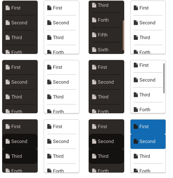
The GIF in use on the LittlevGL README has a very low contrast for the left list:

Maybe it’s just my monitor, but I find it hard to tell when an item is selected. Maybe we should pick a different theme for the left?
The GIF in use on the LittlevGL README has a very low contrast for the left list:

Maybe it’s just my monitor, but I find it hard to tell when an item is selected. Maybe we should pick a different theme for the left?
True.
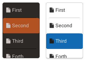
I’ve updated the night theme. It looks like this now:

What do you think?
@kisvegabor Much better!