Porting to 7.0, lv_slider with a knob larger than the background

Description

What MCU/Processor/Board and compiler are you using?

LVGL (v7.0) PC simulator

Commit: e6f89ad7990718b7b0fc85b7aba02edaecdd277c (tag: v7.0.0, upstream/release/v7)

What do you experience?

In v7, I can’t figure out how to make a slider with the following style (picture from v6):

image

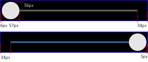
This is what I’ve managed to make in v7 for comparison:

image

What do you expect?

The slider to look like the v6 version.

Code to reproduce

Working v6 style:

#define SLIDER_BAR_HEIGHT 6
#define SLIDER_KNOB_SIZE 56

static void slider_init(void)
{
#if LV_USE_SLIDER != 0
    static lv_style_t slider_bg;
    lv_style_copy(&slider_bg, &lv_style_plain);
    slider_bg.body.main_color = slider_bg.body.grad_color = LV_COLOR_MAKE(0x5b, 0x5b, 0x5b);
    slider_bg.body.radius = LV_RADIUS_CIRCLE;
    slider_bg.body.padding.left = slider_bg.body.padding.right = SLIDER_KNOB_SIZE / 2;
    slider_bg.body.padding.top = slider_bg.body.padding.bottom = (SLIDER_KNOB_SIZE - SLIDER_BAR_HEIGHT) / 2;

    static lv_style_t slider_indic;
    lv_style_copy(&slider_indic, &lv_style_plain);
    slider_indic.body.main_color = slider_indic.body.grad_color = LV_COLOR_MAKE(0x24, 0x61, 0x92);
    slider_indic.body.radius = LV_RADIUS_CIRCLE;
    slider_indic.body.padding.left = 0;
    slider_indic.body.padding.right = 0;
    slider_indic.body.padding.top = 0;
    slider_indic.body.padding.bottom = 0;

    static lv_style_t slider_knob;
    lv_style_copy(&slider_knob, &lv_style_plain);
    slider_knob.body.main_color = slider_knob.body.grad_color = LV_COLOR_MAKE(0xe6, 0xe6, 0xe6);
    slider_knob.body.radius = LV_RADIUS_CIRCLE;

    theme.style.slider.bg    = &slider_bg;
    theme.style.slider.indic = &slider_indic;
    theme.style.slider.knob  = &slider_knob;
#endif
}

Ported v7 style:

#define SLIDER_BAR_HEIGHT 6
#define SLIDER_KNOB_SIZE 56

static void slider_init(void)
{
#if LV_USE_SLIDER != 0
	style_init_reset(&slider_knob);
	lv_style_set_radius(&slider_knob, LV_STATE_DEFAULT, LV_RADIUS_CIRCLE);
	lv_style_set_bg_opa(&slider_knob, LV_STATE_DEFAULT, LV_OPA_COVER);
	lv_style_set_bg_color(&slider_knob, LV_STATE_DEFAULT, LV_COLOR_MAKE(0xe6, 0xe6, 0xe6));

	style_init_reset(&slider_bg);
	//lv_style_set_border_width(&slider_bg, LV_STATE_DEFAULT, (SLIDER_KNOB_SIZE - SLIDER_BAR_HEIGHT) / 2);
	//lv_style_set_border_color(&slider_bg, LV_STATE_DEFAULT, LV_COLOR_BLACK);
	//lv_style_set_border_opa(&slider_bg, LV_STATE_DEFAULT, LV_OPA_COVER);
	lv_style_set_pad_left(&slider_bg, LV_STATE_DEFAULT, SLIDER_KNOB_SIZE / 2);
	lv_style_set_pad_right(&slider_bg, LV_STATE_DEFAULT, SLIDER_KNOB_SIZE / 2);
	lv_style_set_pad_top(&slider_bg, LV_STATE_DEFAULT, (SLIDER_KNOB_SIZE - SLIDER_BAR_HEIGHT) / 2);
	lv_style_set_pad_bottom(&slider_bg, LV_STATE_DEFAULT, (SLIDER_KNOB_SIZE - SLIDER_BAR_HEIGHT) / 2);
	lv_style_set_radius(&slider_bg, LV_STATE_DEFAULT, LV_RADIUS_CIRCLE);
	lv_style_set_bg_opa(&slider_bg, LV_STATE_DEFAULT, LV_OPA_COVER);
	lv_style_set_bg_color(&slider_bg, LV_STATE_DEFAULT, LV_COLOR_MAKE(0x5b, 0x5b, 0x5b));

	style_init_reset(&slider_indic);
	lv_style_set_radius(&slider_indic, LV_STATE_DEFAULT, LV_RADIUS_CIRCLE);
	lv_style_set_bg_opa(&slider_indic, LV_STATE_DEFAULT, LV_OPA_COVER);
	lv_style_set_bg_color(&slider_indic, LV_STATE_DEFAULT, LV_COLOR_MAKE(0x24, 0x61, 0x92));

#endif
}

Uncommenting the border gives this result, which is nearly there (see a bit of grey at the far left), but not a great solution because I assume it involves lots of overdraw:

image

Screenshot and/or video

Included inline.

Misc

I was using lv_slider_set_knob_in(slider, true); in the v6 code too which has been removed in v7. I’ve used the lv_style_set_pad_left/right functions in v7 which seems to do the same thing.

Is there a style I can set that I’m missing that can achieve the effect I’m after? I’ve tried all the margin and pad styles on all 3 different styles without luck!

It looks like it’s not possible to adjust the background draw area:

This is how the indic draw area is modified:

I assumed that LV_BAR_PART_BG style_pad_* would be used to adjust the padding on the background and LV_BAR_PART_INDIC style_pad* would be used to adjust the padding on the indicator. It seems that LV_BAR_PART_BG controls the padding on the indicator and LV_BAR_PART_INDIC padding does nothing.

You can just set the background opacity to be entirely transparent. You may also need to tweak the padding on one of the other styles to fix the extra gray on the bar.

It works for me:


    lv_style_init(&slider_knob);
    lv_style_set_radius(&slider_knob, LV_STATE_DEFAULT, LV_RADIUS_CIRCLE);
    lv_style_set_bg_opa(&slider_knob, LV_STATE_DEFAULT, LV_OPA_COVER);
    lv_style_set_bg_color(&slider_knob, LV_STATE_DEFAULT, LV_COLOR_MAKE(0xe6, 0xe6, 0xe6));
    lv_style_set_pad_left(&slider_knob, LV_STATE_DEFAULT, 5);
    lv_style_set_pad_right(&slider_knob, LV_STATE_DEFAULT, 5);
    lv_style_set_pad_top(&slider_knob, LV_STATE_DEFAULT, 5);
    lv_style_set_pad_bottom(&slider_knob, LV_STATE_DEFAULT, 5);

    lv_style_init(&slider_bg);
    lv_style_set_radius(&slider_bg, LV_STATE_DEFAULT, LV_RADIUS_CIRCLE);
    lv_style_set_bg_opa(&slider_bg, LV_STATE_DEFAULT, LV_OPA_COVER);
    lv_style_set_bg_color(&slider_bg, LV_STATE_DEFAULT, LV_COLOR_MAKE(0x5b, 0x5b, 0x5b));

    lv_style_init(&slider_indic);
    lv_style_set_radius(&slider_indic, LV_STATE_DEFAULT, LV_RADIUS_CIRCLE);
    lv_style_set_bg_opa(&slider_indic, LV_STATE_DEFAULT, LV_OPA_COVER);
    lv_style_set_bg_color(&slider_indic, LV_STATE_DEFAULT, LV_COLOR_MAKE(0x24, 0x61, 0x92));

Take a look at the documentation of the slider. Style properties are used a works a little differently than in v6.

lv_slider_set_knob_in can be “simulated” with padding on the background, but it also “pulls in” the indicator.

    lv_style_set_pad_left(&slider_bg, LV_STATE_DEFAULT, 20);
    lv_style_set_pad_right(&slider_bg, LV_STATE_DEFAULT, 20);

This code shows a nice effect (increase the knob when pressed) which is quite easy to achieve with the new styles:

    /*Make the knob larger when pressed.*/
    lv_style_set_pad_left(&slider_knob, LV_STATE_PRESSED, (SLIDER_KNOB_SIZE - SLIDER_BAR_HEIGHT) / 2);
    lv_style_set_pad_right(&slider_knob, LV_STATE_PRESSED, (SLIDER_KNOB_SIZE - SLIDER_BAR_HEIGHT) / 2);
    lv_style_set_pad_top(&slider_knob, LV_STATE_PRESSED, (SLIDER_KNOB_SIZE - SLIDER_BAR_HEIGHT) / 2);
    lv_style_set_pad_bottom(&slider_knob, LV_STATE_PRESSED, (SLIDER_KNOB_SIZE - SLIDER_BAR_HEIGHT) / 2);
    lv_style_set_transition_time(&slider_knob, LV_STATE_DEFAULT, 200);
    lv_style_set_transition_prop_1(&slider_knob, LV_STATE_DEFAULT, LV_STYLE_PAD_BOTTOM);
    lv_style_set_transition_prop_2(&slider_knob, LV_STATE_DEFAULT, LV_STYLE_PAD_TOP);
    lv_style_set_transition_prop_3(&slider_knob, LV_STATE_DEFAULT, LV_STYLE_PAD_LEFT);
    lv_style_set_transition_prop_4(&slider_knob, LV_STATE_DEFAULT, LV_STYLE_PAD_RIGHT)

sl

Thank you @kisvegabor! It works just how I want it now. That animation is really cool too!

The main issue I was having is that I thought the slider needed to be sized to contain the knob as so - this worked in 6.0:

image

But I needed it sized like this, with the knob overflowing the slider object:

image

It’s a little confusing as I thought anything outside of the object bounds was clipped, but reading the docs more closely it seems that objects are only clipped to their parent’s bounds: “Children can be visible only on their parent. It other words, the parts of the children out of the parent are clipped.” It may be useful to add something to the slider docs which explains that the size of the slider corresponds to the size of the underlying bar, and the knob overflows the object bounds.

I think there might be an off-by-one error in the knob width, it’s showing as 56x57 px. This causes a mismatch in padding as well - the knob is 1px closer to the edge on the right:

image

If you look closely at the video you posted the knob is rectangular too (19x18px) so it’s not just something I’ve done.

I think the issue is with this line (and presumably L470):

The fix appears to be this:

    if(hor) {
        knob_area->x1 -= (knob_size >> 1);
        knob_area->x2 = knob_area->x1 + knob_size - 1;
        knob_area->y1 = slider->coords.y1;
        knob_area->y2 = slider->coords.y2;
    }
    else {
        knob_area->y1 -= (knob_size >> 1);
        knob_area->y2 = knob_area->y1 + knob_size - 1;
        knob_area->x1 = slider->coords.x1;
        knob_area->x2 = slider->coords.x2;
    }

It looks like if knob_area->x1 is 10 before and knob_size is 6, the code will calculate knob_area->x1 = 7 and knob_area->x2 = 13, which give a knob (13 - 7 + 1) = 7 wide due to the inclusive upper bound.

I can send a PR for this if you’d like? Or I’m happy for you to go ahead an commit the fix yourself, if you agree this is the solution!

The behavior of some objects has changed between 6.x and 7.0, as we moved to using a new style system and composition architecture. That’s why the dedicated knob_in feature was removed - styles allow you to express the same thing by sizing the object appropriately.

I agree with your fix. Can you send a PR please?