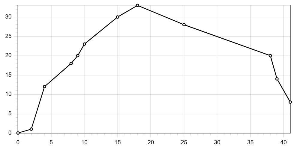
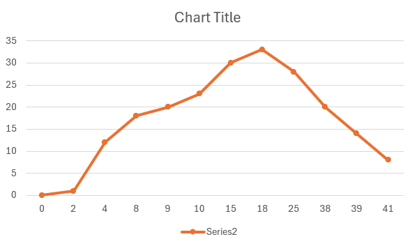
If I use y to create a chart, the graph does not represent the real shape of the data. It will look like this:
I’ve seen a couple of posts about controlling the X-axis. For example, this post described how to set the tick values. However, the points are equally distributed.
I also ran into a post that suggested using a container and lines to create a custom chart.
Is there a way to create such a graph using the chart?
Add ticks and labels to the axis and demonstrate scrolling
*/
int app_chart_3(lv_obj_t parent)
{
lv_obj_t chart = lv_chart_create(lv_scr_act());
lv_obj_set_size(chart, 600, 200);
lv_obj_center(chart);