My text when using the montserrat font has very odd blending or coloring or some sort of gradient. When I try to use lv_font_unscii_16 it appears correctly.
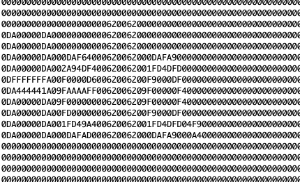
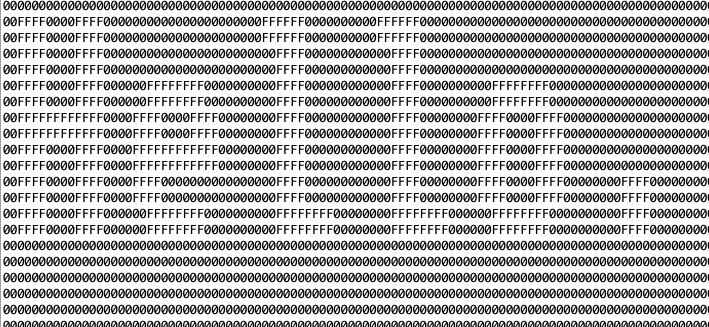
I am printing out the upper nibble of each pixel in the flush callback.
Is this due to some incorrect setting in my theme? Why would these fonts display differently when the colors are set the same (basic black and white in the style?
My display is set to #define LV_COLOR_DEPTH 8
Any help would be very appreciated!
Here is the label:
    lv_obj_t * label1 = lv_label_create(lv_scr_act());
    lv_label_set_text(label1, "Hello.");
    lv_obj_add_style(label1, &text_style, LV_PART_MAIN);
Here are each style:
lv_font_unscii_16
    lv_style_t text_style;

    lv_style_init(&text_style);
    lv_style_set_text_color(&text_style, lv_color_white());
    lv_style_set_text_font(&text_style, &lv_font_unscii_16);
lv_font_montserrat_14
    lv_style_t text_style;
    lv_style_init(&text_style);
    lv_style_set_text_color(&text_style, lv_color_white());
    lv_style_set_text_font(&text_style, &lv_font_montserrat_14);