Hello everyone!
Radio buttons are frequently used and can be integrated as a basic widget into LVGL.
How to implement radio buttons with the LVGL Editor now?
Hello everyone!
Radio buttons are frequently used and can be integrated as a basic widget into LVGL.
How to implement radio buttons with the LVGL Editor now?
Hello!
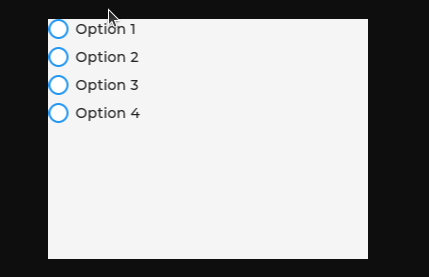
You can implement radio buttons with LVGL Pro Editor with the following XML:
<screen>
	<styles>
		<style name="style_main" layout="flex" flex_flow="column" />
		<style name="style_radio" radius="10" />
		<style name="style_checked" bg_image_src="NULL" />
	</styles>
	<view>
		<style name="style_main" />
		<lv_checkbox text="Option 1">
			<style name="style_radio" selector="indicator" />
			<style name="style_checked" selector="indicator|checked" />
		</lv_checkbox>
		<lv_checkbox text="Option 2">
			<style name="style_radio" selector="indicator" />
			<style name="style_checked" selector="indicator|checked" />
		</lv_checkbox>
		<lv_checkbox text="Option 3">
			<style name="style_radio" selector="indicator" />
			<style name="style_checked" selector="indicator|checked" />
		</lv_checkbox>
		<lv_checkbox text="Option 4">
			<style name="style_radio" selector="indicator" />
			<style name="style_checked" selector="indicator|checked" />
		</lv_checkbox>
	</view>
</screen>
This will create the following UI:
With LVGL Pro, the options are limitless. As @giobauermeister showed, you can additionally use a subject if you need to show one selected item at a time. You can also build your own widget and have custom functionality.
Find more samples here:
It’s really a basic thing. I’ll check how can we add it in a good way today.
Just opened a PR for it: feat(radio_button): add LV_OBJ_FLAG_RADIO_BUTTON by kisvegabor · Pull Request #9328 · lvgl/lvgl · GitHub
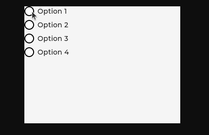
Thank you so much for your reply, my friend. However, I wish the filled part of the radio button wasn’t so large. How can I achieve this?

I really appreciate your help with resolving this issue. I will verify the solution you provided.
I was able to achieve almost the same style as you want but not exactly.
I used this XML:
<screen>
	<styles>
		<style name="style_main" layout="flex" flex_flow="column" />
		<style name="style_radio" radius="100" border_width="2" border_color="0x000000" />
		<style name="style_checked" bg_image_src="NULL" border_width="5" border_color="0x000000" bg_color="0xffffff" />
	</styles>
	<view>
		<style name="style_main" />
		<lv_checkbox text="Option 1">
			<style name="style_radio" selector="indicator" />
			<style name="style_checked" selector="indicator|checked" />
		</lv_checkbox>
		<lv_checkbox text="Option 2">
			<style name="style_radio" selector="indicator" />
			<style name="style_checked" selector="indicator|checked" />
		</lv_checkbox>
		<lv_checkbox text="Option 3">
			<style name="style_radio" selector="indicator" />
			<style name="style_checked" selector="indicator|checked" />
		</lv_checkbox>
		<lv_checkbox text="Option 4">
			<style name="style_radio" selector="indicator" />
			<style name="style_checked" selector="indicator|checked" />
		</lv_checkbox>
	</view>
</screen>
And the result is this:
@fbiego @kisvegabor Do you think we could achieve exactly that same style for the radio buttons?
What about using a black circle and a white outline with -1 outline_pad?