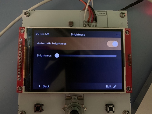
Description
Hello, I’d like to build a simple menu with a slider for setting the screen brightness and a switch to enable or disable automatic brightness.
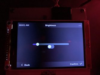
This menu should be completely browsable with an encoder and a button. I already made a simple version of this menu, but I’m not satisfied with its appearance. Right now, when I focus the switch or the slider by rotating the encoder, I can see a small outline that shows which one is selected. Since my project should be used on a vehicle, I would prefer something more visible. I don’t like very much the idea of enlarging the existing outline.
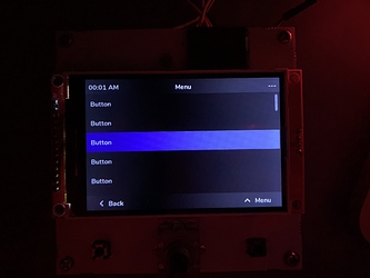
At the same time, I built a fake “main menu” with 30 buttons in a full-screen list, and by using a custom style, I can show which button is selected by changing its background color to a bright one.
What MCU/Processor/Board and compiler are you using?
ESP-32 with ESP-IDF 4
What LVGL version are you using?
release/v7 branch
What do you want to achieve?
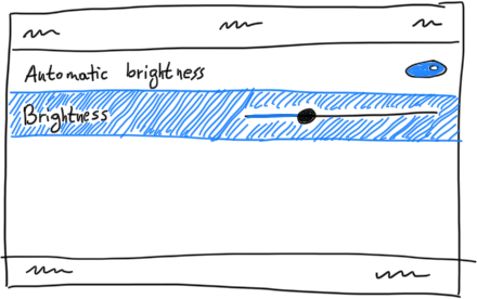
What I would like to achieve is a menu with the same appearance of a list, but also include an arbitrary widget (such as a switch) on the right side of the list item, which can be toggled (or focused for editing, when using a slider) by pressing a button, which I can already do.
In general, I would like a screen-wide scrollable menu, with N items. Inside each item there should a label on the left and an interactive widget on the right. It’s important for the entire line to be highlighted when it’s focused, and to slightly change its color to a brighter tone when entering edit mode (when using a slider).
What have you tried so far?
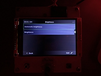
I tried to add a widget to the button returned from lv_list_add_btn and to align it inside of the button, but it doesn’t get aligned correctly.
Code to reproduce
My first solution (the working one, but hard to read):
  // Content
  lv_obj_t *view_content = lv_cont_create(NULL, NULL);
  lv_obj_add_style(view_content, LV_CONT_PART_MAIN, &tk_style_far_background);

  // Group (for encoder)
  group = lv_group_create();

  // Slider
  lv_obj_t *slider = lv_slider_create(view_content, NULL);
  lv_obj_align(slider, view_content, LV_ALIGN_CENTER, 0, 0);
  lv_group_add_obj(group, slider);

  // Switch
  lv_obj_t *auto_switch = lv_switch_create(view_content, NULL);
  lv_obj_align(auto_switch, slider, LV_ALIGN_OUT_BOTTOM_MID, 0, 0);
  lv_group_add_obj(group, auto_switch);

  // Group
  lv_indev_set_group(encoder_indev, group);
Experiment with lists (wrong, but what in my mind I would like to achieve):
  // Content
  lv_obj_t *view_content = lv_cont_create(NULL, NULL);
  lv_obj_add_style(view_content, LV_CONT_PART_MAIN, &tk_style_far_background);

  // Group (for encoder)
  group = lv_group_create();

  // List
  lv_obj_t *list = lv_list_create(view_content, NULL);
  lv_group_add_obj(group, list);
  lv_indev_set_group(encoder_indev, group);

  // NOTE: This is the code I use to build the navigation menu that I like
  lv_obj_add_style(list, LV_LIST_PART_BG, &tk_style_menu_fullscreen);
  lv_obj_add_style(list, LV_LIST_PART_SCROLLABLE, &tk_style_menu_fullscreen);
  lv_obj_set_size(list, 480, 320 - (2 * 36));
  lv_obj_align(list, view_content, LV_ALIGN_CENTER, 0, 0);
  lv_obj_add_style(list, LV_CONT_PART_MAIN, &tk_style_far_background);

  // Switch (auto_switch is declared at the beginning of the file, same for slider)
  lv_obj_t *auto_switch_button = lv_list_add_btn(list, NULL, "Automatic brightness");
  auto_switch = lv_switch_create(auto_switch_button, NULL);
  lv_obj_align(auto_switch, auto_switch_button, LV_ALIGN_IN_RIGHT_MID, 0, 0);

  // Slider
  lv_obj_t *slider_button = lv_list_add_btn(list, NULL, "Brightness");
  slider = lv_slider_create(slider_button, NULL);
  lv_obj_align(slider, slider_button, LV_ALIGN_IN_RIGHT_MID, 0, 0);
Screenshot and/or video
A picture of the navigation menu (with no widgets) I like:
A picture of the settings menu obtained from the first code example:
A picture of the failed try (second example):
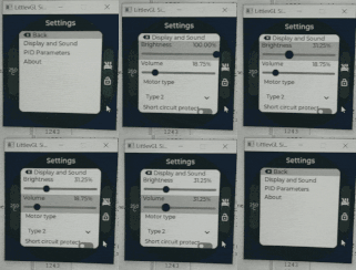
A sketch of what I would like to have (view on bright background because it’s a transparent PNG):
I’m asking what would be the most reusable solution, since I’ll need to add many menus like these over time.
I hope I exposed my ideas clearly, I imagine this could be a strange design. If it is fundamentally wrong, I’ll gladly accept suggestions for building it in a different manner.
Thanks.
